Are You Designing for Visual Impairment?
When we think about selecting a font for a print marketing piece, we tend to think about the creative aspects of  the selection. Does it match the branding? Will it convey the right message (strength, creativity, whimsy) to the target audience? But there are some practical issues that need to be considered as well.
These relate to readability.
Not everyone in your target audience has the same level of vision. Older members might be facing issues like cataracts, macular degeneration, or glaucoma. Even younger consumers may have untreated amblyopia or eye teaming. These visual issues make reading challenging. If your audience has trouble just reading the words, the larger marketing message will get lost.
According to the American Foundation for the Blind, when choosing a font, here are some specific things to consider for target audiences (or portions of those audiences) who might be facing vision issues:
- Font type: Use easily recognizable characters in fonts such as standard Roman or Arial. Avoid decorative fonts.
- Font size: Increase the font size to make it easier to read. This is especially important for in-store displays, signage, and other materials that may be read from a distance.
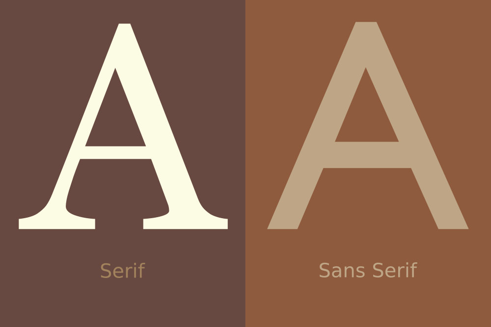
- Serif vs. sans serif: For maximum readability, use a sans serif typeface.
- Bold it: When possible, use bold type because the thickness of the letters makes the print more legible.
- Contrast: Choose colors and type styles that contrast from their background. The more contrast, the easier the font is to read.
You may want to avoid using italics or all capital letters. Both make it more difficult to differentiate letters. If you are going to a general audience, it might be worth segmenting out specific age groups or other demographics and including font selection and sizing as part of the customization.
Need help selecting the right font for your audience or to segment your projects to get the right match between the two? Let us help.


