
Avoid These Top 5 Typography Mistakes
 When you are putting your best foot forward, it’s important to pay attention to the details. Details can make the difference between looking like everyone else and really standing out.
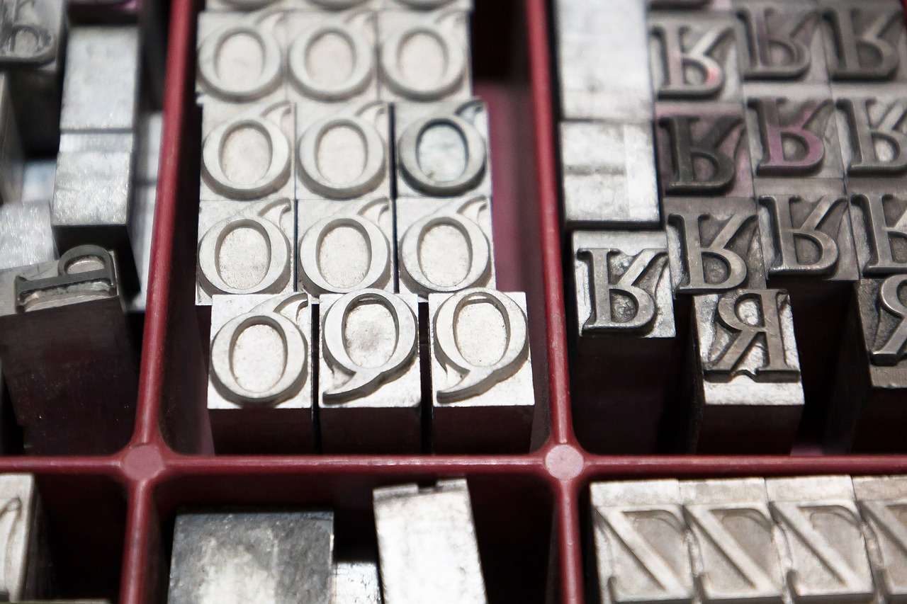
When it comes to the design and layout of your print materials, one of those details is attending to the fine points in typography. According to Creative Bloq’s Christopher Phin, here are five very common typography conventions you want to maintain.
1. Using smart quotes. Whether you are reproducing a quote or citing a magazine article, you should use smart quotes (“this”) instead of the straight quote marks.
2. Proper use of the apostrophe. Your keyboard doesn’t know when you are shortening a word or making a citation. When using them to indicate shortening, the mark should always curl toward the missing material. For example, it’s not “Keep ‘em coming.” It’s “Keep ’em coming.” Or when referring to dates, it’s the ’90s, not the ‘90s.
3. Using primes. When typing, many of us use straight quotes to refer to feet and inches. But the correct convention is to use primes, which tilt at a slight angle. Instead of typing 5′ 6″, type 5′ 6″ instead.
4. Properly set fractions. Like straight quotes instead of primes, many of us type fractions using the slash mark (1/2 or 1/4). Instead, most typefaces have dedicated glyphs for the most common fractions that should be used. For example, ½ and ¼.
5. Multiplication ‘x.’ Oh, that pesky math! Like fractions, there is a convention for that multiplication ‘x.’ Instead of referring to 8 ½ x 11” sheets, it should be 8 ½ × 11”.
Use this simple checklist to clean up your typography and ensure that it looks its absolute best.
RECENT BLOGS

New RIT Certifications for Convertible Solutions Products
Wednesday September 28, 2022
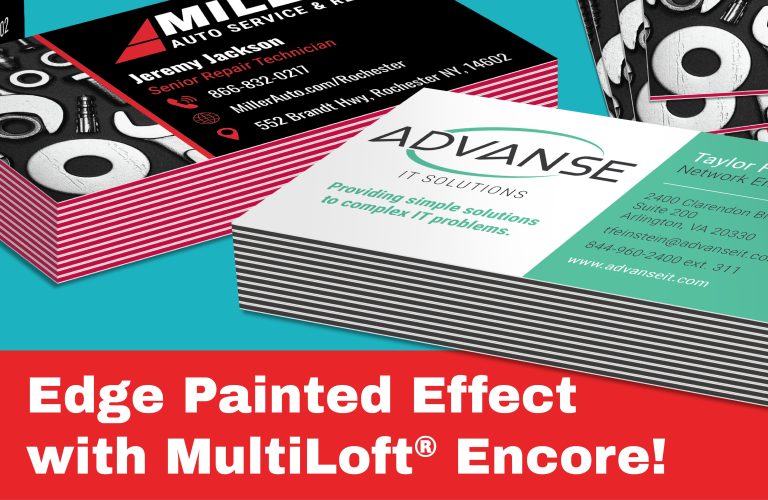
Edge Painted Effect with MultiLoft® Encore
Wednesday August 24, 2022