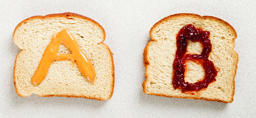
What Can You Learn From A/B Testing?
 Think you know everything about your customers? After all, you already target based on demographics.
You regularly send out surveys to better understand their behavior. You even update their channel preferences. What else can you still learn? A lot.
On the marketing blog of Unbounce, which allows marketers to build, publish, and test landing pages, Unbounce described four case studies and the critical lessons learned from A/B testing in each one. The conclusion? Never take your understanding of your customers for granted. Let’s take a brief look at each one.
SafeSoft Solutions
One marketer, SafeSoft Solutions, had a slick, professional ad that was doing well. The headline promoted productivity and efficiency. It used attention grabbing, easy-to-read bullet points to outline the benefits of its services. It offered an easy call to action. But the ad did not contain pricing information. SafeSoft decided to test the addition of a green starburst with the pricing inside. The result? A 100% increase in conversions. Lesson learned? Customers want to know the pricing upfront!
HubSpot
Not all trial offers are created equal.
For some companies, a seven-day offer might be perfect. For others, customers might need a longer trial period to fully explore the solution.
When HubSpot A/B tested its trial offer, for example, it found that prospects needed more time to make a decision. By switching from a seven-day trial to a 30-day trial, it boosted conversions by 110%.
Inbound Strategy
Does placement of the CTA make a difference in conversions? Inbound Strategy wanted to find out. It tweaked the site’s landing page, added more information, and played with the location of the CTA. The results? When the CTA was moved from the right-hand side of the page to the left, there was a 217% increase in conversions compared to the control landing page and Variant A.
EA Sports
EA Sports, known for its high-end image, created and tested two versions of one of its ads. One was a traditional advertisement on a black background with slick photography.
The other was a sketch done in Microsoft Paint with a childlike drawing of a race car. Guess which one performed best? Lesson learned: sometimes more simplistic ads can pique people’s interest more.
These examples have lessons for us, as well. Whether you are working with print, email, landing pages, or any other channel, if you’re not doing A/B testing on a regular basis, you’re missing opportunities. What insights and higher conversion rates might you be missing?
RECENT BLOGS

Celebrating the Journey: 20 Years of Convertible Solutions! Chapter 8
Monday December 29, 2025

Celebrating the Journey: 20 Years of Convertible Solutions! Chapter 7
Tuesday September 9, 2025
Celebrating the Journey: 20 Years of Convertible Solutions! Chapter 6
Tuesday August 5, 2025


